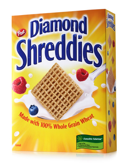
The story of Shreddies is the ideal case study for demonstrating the possibility of creating intangible added value for a brand without modifying the product at all. For those who are unfamiliar, Shreddies is a square-shaped breakfast cereal brand born more than 60 years ago and sold in England, Canada, and New Zealand.
In 2008, Kraft Foods went to advertising agency Ogilvy & Mather Toronto in order to create a campaign designed to return Shreddies to its spot as a leader in the breakfast market. Although sales were not satisfactory, focus groups found that consumers were still happy with the quality of the product itself.
Diamond Shreddies is born
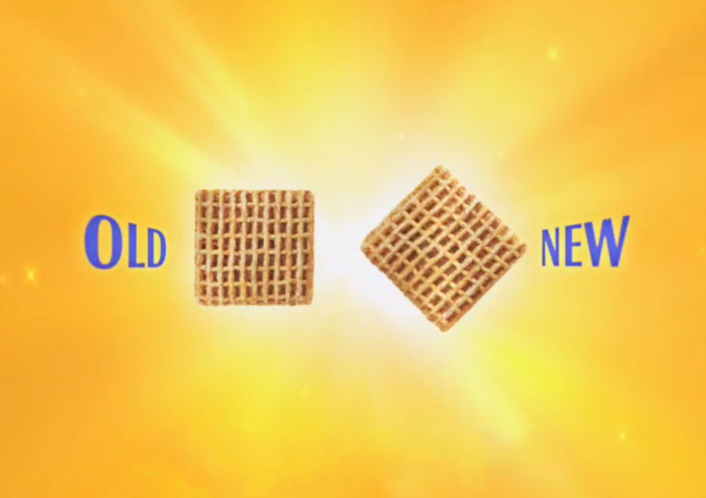
During one of the brainstorming meetings at Ogilvy, Hunter Somerville, a 26 year-old intern, held up one of the Shreddies, and joked “it isn’t a square, it’s a diamond.” While for Somerville it was merely a silly joke, Nancy Vonk, the leader of the creative team, saw the possibility of something more and encouraged him to develop the idea. And thus, Diamond Shreddies was born. A new product that maintained all the physical characteristics of the original product, but with a revamped image. Consumers had the option of choosing between the two shapes —traditional or diamond— both of which were, in fact, the same exact product. There was even a “Combo Pack” that supposedly contained both versions.

The advertising campaign used many means of media that included advertisements on the street, television commercials, in print, and through the use of a website, as well as packaging design. The tone of the campaign was humorous and ironic so consumers were well aware that the product was the same. The website, for instance, stated “Recent advances in cereal technology have allowed us to take Shreddies cereal to a whole new level of geometric superiority”. Some of the commercials featured funny focus groups in which the product was tested and people stated rather curious things, such that diamond shreddies not only looked better, but tasted better than the original!
The outcome of the campaign was excellent, with a market share increase of 18% during the first month, and the acquisition of several awards, among them the 2008 Grand Clio Award. Currently, Diamond Shreddies does not exist, but remains in our memories as an impressive anecdote. There is no better example of how a change in perspective can revitalize a product.


Thanks, it’s a brilliant case study and a clever use of humour to build hunger. It also makes my brain look for ways to do the same for ou clients. Cheers….
Bring back Diamond Shreddies.
Bring back Diamond Shreddies! Every time I go to the store and say out load where are the Diamond Shreddies? And I walk away disappointed!
You’re looking at the product the wrong way, Park your head 45 degrees and you’ll see the diamond Shreddies are the only ones on the shelves.
Diamond Shreddies honestly made me feel so insulted that I started to question whether I would ever want to buy that product again.
I didn’t see the ‘humour’ in it at all. You can’t ironically market the product as new without changing it and then also ironically profit from it.
Ohh Marlon, you poor humorless individual
They can, and did, to great success lol. Some folks have a sense of humour.
I remember the TV ads and laughed uproariously. Then sent a box to my brother, a big Shreddies fan, in California.